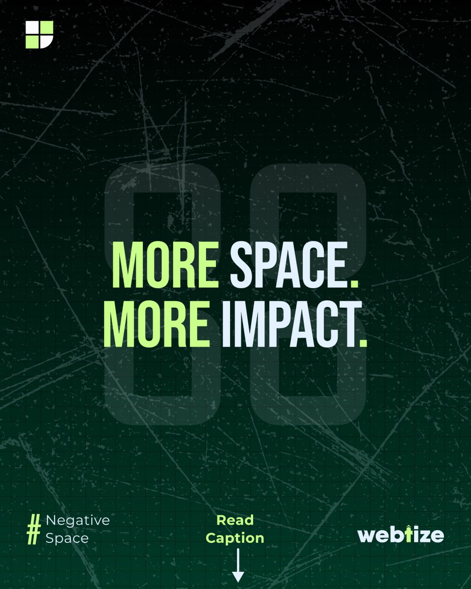
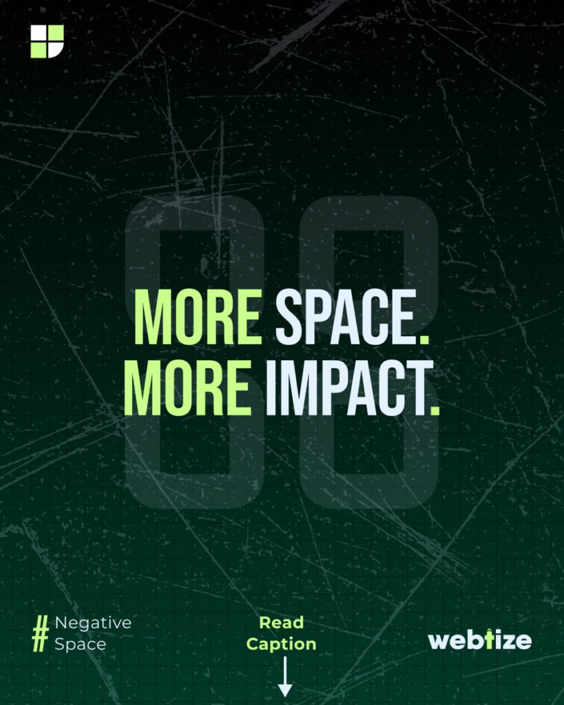
Stop crowding. Start breathing. In 2025, white space design (also called negative space) is one of the strongest signals of premium branding. Far from being wasted or empty, space between elements guides focus, communicates luxury, and makes your brand feel intentional.
When used strategically, whitespace improves engagement, increases retention, and builds trust. Apple, Tesla, and Chanel are famous examples of how luxury design relies on space as much as typography, color, and imagery.
What is white space in design?
White space is the area around text, images, or components that is intentionally left blank. It does not have to be white—it can be any background color. The goal is to give breathing room to key elements, reduce clutter, and create hierarchy.
Therefore, negative space branding is not an accident. It is a deliberate choice that shapes how people perceive your product, website, or packaging.
Why white space matters for branding
- Guides user focus
When everything competes for attention, nothing wins. White space reduces distractions and draws the eye to what matters most. - Signals luxury and minimalism
Empty space does not mean unfinished—it conveys exclusivity. Luxury brands use it to suggest confidence and refinement. - Improves comprehension and retention
Studies in visual communication show that uncluttered layouts increase readability and memory recall. - Boosts engagement
Clean layouts reduce friction. As a result, users stay longer, interact more, and complete more actions.
Examples of whitespace branding
- Apple
Their product pages are clean, image-driven, and rely heavily on space to highlight technology. - Tesla
Minimalist web design emphasizes product photography, with space framing each detail. - Chanel
Packaging and advertising use negative space to project elegance and exclusivity.
These examples prove that whitespace is not decoration—it is strategy.
Applying white space to your brand
1. Website design
Use consistent spacing in layouts, balance images with copy, and keep one main action visible at all times. Minimalist web design is proven to increase conversions by improving clarity.
2. Logo and identity
Negative space logos (such as FedEx with its hidden arrow) add depth and memorability. For luxury branding, fewer elements often mean stronger recognition.
3. Packaging and print
Luxury products rely on clean packaging. A box or label with generous spacing around the logo feels more premium than one crowded with information.
4. Digital advertising
Ad creatives with breathing room stand out more than overdesigned graphics. Whitespace increases click-through rates because the message is clear.
A 30-day white space optimization plan
Week 1 – Audit your brand assets
Review your website, ads, and packaging. Identify areas that feel cluttered or cramped.
Week 2 – Simplify layouts
Reduce text blocks, enlarge margins, and remove non-essential elements.
Week 3 – Test engagement metrics
Compare bounce rates, scroll depth, and conversions before and after whitespace adjustments.
Week 4 – Scale across channels
Apply whitespace principles consistently across social media, landing pages, and email campaigns.
Common mistakes to avoid
- Overcrowding with text: Long paragraphs or walls of copy reduce readability.
- Overusing decorative elements: Icons, shapes, and gradients can distract from the core message.
- Inconsistent spacing: Random padding or margins break visual rhythm.
- Fear of emptiness: Remember, whitespace is not wasted—it is powerful branding.
Work with Webtize
At Webtize, we design conversion-focused websites and luxury brand identities that use white space strategically. From logos to packaging to digital advertising, we create designs that breathe, engage, and sell.