Good design is not only seen. It is followed. When a layout guides the eye from headline to proof to call to action, people move with confidence. This is the work of visual hierarchy. It uses contrast, size, spacing, and grouping to signal what matters first, next, and last. Consequently, users spend less effort finding the next step and more time completing it.
People scan before they read, often in predictable patterns across the top and left of a page. Therefore, your structure must meet scanning behavior with clear anchors and obvious actions. Place the right cues in the right order and you turn views into clicks.
How visual hierarchy guides the eye
Visual hierarchy clarifies importance using a few reliable levers:
- Scale and weight make headlines and buttons stand out
- Contrast separates primary from secondary content
- Grouping and whitespace create chunks people can scan
- Position aligns with scanning patterns so key items are found fast
When these levers reinforce each other, the path becomes obvious. Users should see a promise, a proof point, and a single clear action without hesitation.
Practical checklist you can apply today
- Start each page with one primary message and a matching action
- Use a strong headline, a short support line, and one primary button above the fold
- Keep secondary links visually lighter and placed after the main action
- Present content in scannable blocks with clear subheadings
- Trim decorative elements that do not support the task
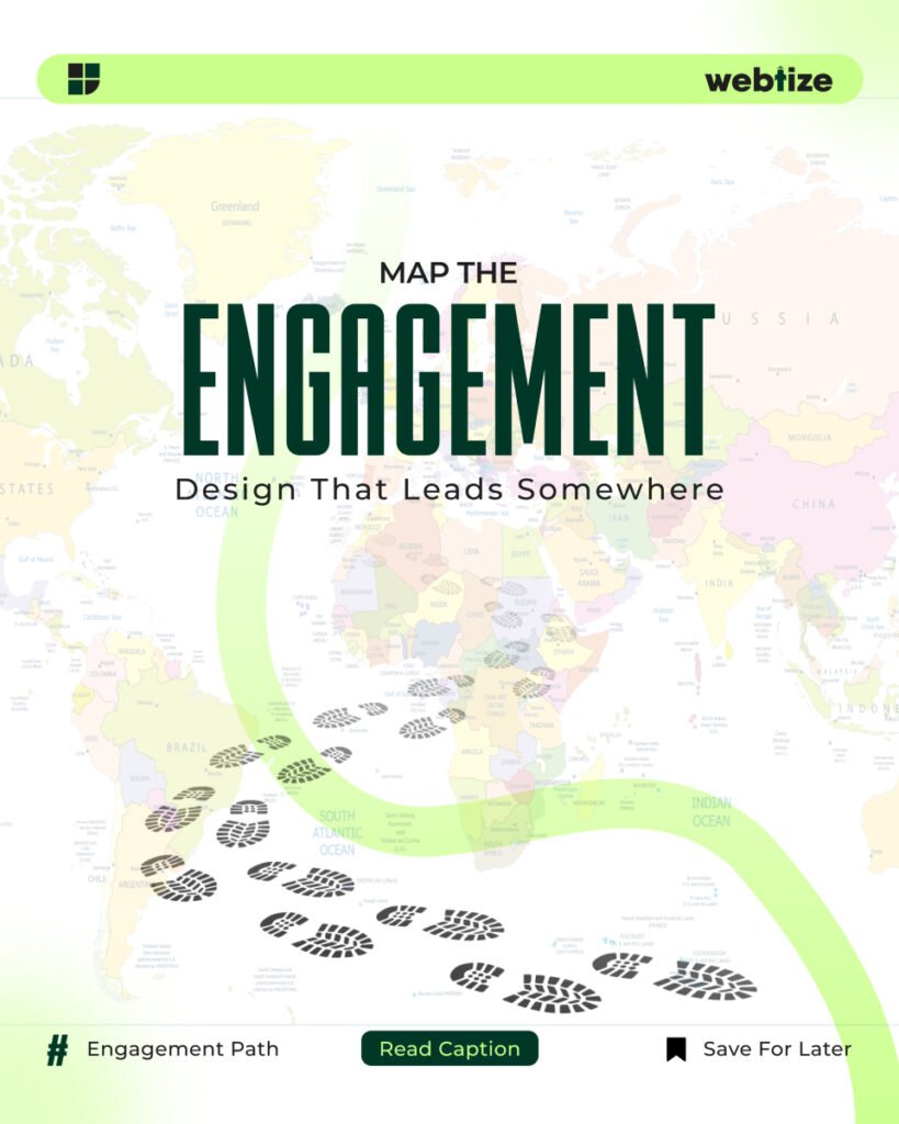
Map the user journey with information scent
People choose links that promise the highest value with the least cost, a behavior explained by information scent. Clear labels, descriptive buttons, and consistent wording help users predict what is next and feel safe moving forward. Strengthen scent from listing to detail to checkout with language that matches intent.
Example
If the goal is a demo request, pair a headline that states the outcome with a button that repeats it, such as “See a live demo.” Avoid vague phrases like “Learn more,” which weaken scent and stall progress.
From attention to action: CTA design that converts
Calls to action work when they are prominent, descriptive, and consistent. Research shows that clear labels, adequate size, and logical placement increase completion. Place the primary button where scanning ends on the current block and give it sufficient contrast from the background and nearby elements. Baymard Institute
Implementation tips
- Use a single primary button per section to prevent choice overload
- Keep labels action oriented and specific to the outcome
- Reserve the strongest color for the primary action throughout the site
- Provide visible feedback on hover, focus, and tap states
For commerce and lead gen flows, position important actions high on the page with supporting content nearby. Several industry playbooks and studies highlight the impact of visible search, clear CTAs above the fold, and simplified layouts that reduce cognitive load.
Layout patterns that respect how people scan
Design for common scanning behaviors. The F-pattern concentrates attention across the top and down the left, while other patterns like layer-cake scanning rely on strong subheads to structure content. Use these patterns to place headlines, proof, and actions where eyes naturally land.
Simple pattern for a hero block
- Line 1: Promise in plain language
- Line 2: One supporting line that reduces risk
- Line 3: Primary button with a descriptive label
- Line 4: Subtle secondary link for those not yet ready
A 30-day upgrade plan for visual hierarchy
Week 1. Audit and goals
Identify the primary action for each key page. Map the current scan path with a quick five-second test and note where attention stalls.
Week 2. Structure and copy
Rewrite headlines to state outcomes. Replace weak CTAs with specific labels that match intent. Make sure each section has one clear action tied to its message. Align labels across navigation, buttons, and destination pages to strengthen information scent.
Week 3. Layout and components
Increase contrast for primary buttons and reduce visual weight of secondary links. Group related elements, add whitespace, and reorder modules so proof sits closer to the action. Use consistent spacing and type scales to make sections scannable. Reference retail UX guidance for examples of clear, high-impact placement.
Week 4. Validation and iteration
Run a lightweight usability test. Track click-through rate to primary CTAs, scroll depth, and task success. If clicks concentrate on non-critical elements, adjust hierarchy and labels. Repeat until the majority of users follow the intended path.
Common mistakes and fast fixes
Too many competing actions
Fix by choosing one primary action per section and visually demoting the rest.
Decorative elements that distract
Remove or tone down graphics that do not support the task.
Vague labels that weaken information scent
Replace “Learn more” with outcome-based phrases like “Compare plans” or “See pricing.”
Buttons that blend into the layout
Increase contrast and size, and add clear focus and hover states based on tested button guidelines.
Measure what matters
Tie hierarchy changes to observable outcomes. Track primary CTA click-through rate, time on task, and completion rate for key journeys. Combine these with scroll and heatmap data to confirm that users follow the intended path. When metrics improve alongside qualitative feedback, the hierarchy is doing its job.
Work with Webtize
If you want design that guides users from attention to action, Webtize can help. We map user journeys, tune visual hierarchy, and clarify calls to action across your pages. Explore services at https://webtize.co/ and reach the team at https://webtize.co/contact/.