
Most visits now start on a phone. Global website traffic from mobile devices sits around the sixty to mid-sixty percent range in 2025, not ninety percent. That is still the majority and it keeps growing. Therefore responsive web design remains a non-negotiable for ranking, engagement, and conversions. Google had completed mobile-first indexing, which means your mobile experience is what gets evaluated and indexed first.
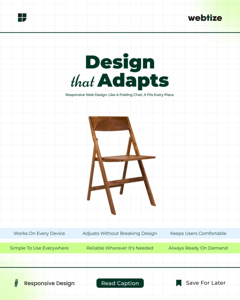
Responsive web design is the approach that adapts layout, media, and interactions to the user’s device. It uses flexible grids, fluid media, and CSS breakpoints so one codebase works across phones, tablets, and desktops. Google continues to recommend mobile-friendly, responsive implementations for search visibility and crawling efficiency.
Why responsive web design still wins
People expect fast, readable pages that fit their screens. A responsive site lowers friction, reduces zooming and pinching, and keeps the focus on the task. Search engines reward sites that deliver a good experience, especially on mobile devices, where attention is scarce. In addition, a single responsive codebase is easier to maintain than separate mobile and desktop sites, which reduces errors and speeds up releases. Google’s best-practice guidance reflects this mobile-first reality. Google for Developers
Core principles of responsive web design
Flexible layout and modern CSS
Use CSS Grid and Flexbox for fluid, two-dimensional layouts. Replace hard pixel widths with percentage-based or logical viewport units. Control typography and spacing with clamp() to scale smoothly between small and large screens. When components need local breakpoints, adopt container queries. These patterns keep content legible without hacks.
Responsive images and media
Serve the right image for the right device with srcset and sizes. Prefer modern formats such as AVIF and WebP for smaller file sizes. Constrain media with max-width: 100% and set intrinsic aspect ratios to prevent layout shifts as content loads.
Mobile-friendly navigation and forms
Use concise menus that prioritize the top tasks. Keep tap targets at least 44 by 44 CSS pixels. Minimize fields, enable auto-complete, and show the correct keyboard for input types. Reduce interruptions that hide primary content on smaller screens.
Performance and Core Web Vitals on mobile
Performance is part of responsiveness. As of March 12, 2024, Interaction to Next Paint (INP) replaced First Input Delay (FID) as a Core Web Vital. Aim for good scores on INP, Largest Contentful Paint (LCP), and Cumulative Layout Shift (CLS) to reduce bounce and improve conversions.
Accessibility and inclusive design
Ensure color contrast meets WCAG targets, support reduced-motion preferences, and keep focus styles visible. Inclusive patterns lift completion rates for everyone and reduce abandonment on small screens.
SEO implications in a mobile-first index
Mobile pages are the source of truth for indexing and ranking. Keep content, structured data, and metadata equivalent on mobile and desktop. Avoid lazy-loading primary content that Google needs to index. Verify that images are high quality on mobile and that important resources are not blocked. Follow the latest mobile-first best practices from Google when auditing.
A 30-day responsive overhaul plan
Week 1. Audit and baselines
Run a crawl to surface mobile issues. Capture mobile CWV baselines. Map pages with horizontal scroll, unreadable text, or blocked resources. Confirm mobile and desktop parity for content and links.
Week 2. Layout and media
Refactor key templates with CSS Grid and Flexbox. Replace fixed widths with fluid units and clamp() for typography. Implement srcset and sizes for hero and product images. Add intrinsic aspect-ratio to eliminate layout shift.
Week 3. Navigation, forms, and performance
Streamline the header and menu. Raise tap target sizes and simplify forms. Ship image compression, preconnect critical domains, and defer non-critical scripts. Focus on improving LCP and INP on mobile.
Week 4. Validation and rollout
Fix remaining CLS issues. Validate with live users on 3G-like throttles. Re-measure CWVs, submit key URLs through Search Console, and ship a pattern library entry for responsive components so the gains persist.
Common mistakes and fast fixes
Assuming traffic is mostly desktop
As of mid-2025, mobile accounts for roughly sixty to sixty-four percent of global website traffic. Design for mobile first, then enhance for larger screens. Exploding Topics
Using breakpoint-only thinking
Breakpoints are helpful but brittle. Use fluid scales and container queries so components adapt within any layout.
Serving the same large assets everywhere
Downscale and compress images. Provide multiple sources and let the browser choose the best fit.
Ignoring input responsiveness
Long tasks and heavy JavaScript degrade perceived speed. Monitor and improve INP so interactions feel immediate.
Measurement that ties to revenue
Track mobile bounce rate, scroll depth, and form completion alongside Core Web Vitals. Monitor conversions by device category and screen width. When INP improves and LCP stabilizes, you should also see gains in engagement and checkouts on mobile. Pair these metrics with Search Console’s mobile usability and indexing reports to catch regressions early.
Work with Webtize.co
If you need a responsive redesign that improves rankings and conversions, Webtize can help. We audit mobile templates, fix layout and media, and raise Core Web Vitals where it matters most. Explore services at Webtize and contact the team at https://webtize.co/contact/. Together we will ship responsive web design that works across screens and wins on mobile.