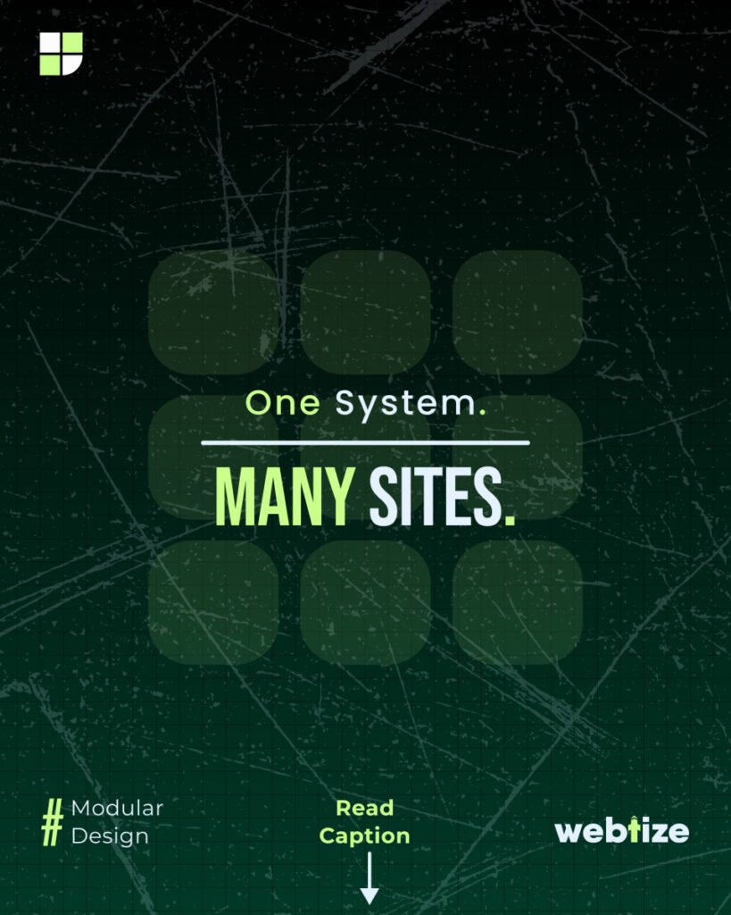
Modern websites are built from repeatable parts. When those parts are designed once and reused everywhere, teams move faster, keep a consistent look, and avoid the usual mistakes that slow launches. That is the promise of modular design: one trusted component library that powers endless page variations with less effort.
What modular design actually means
Modular design treats every piece of the interface as a component. Buttons, cards, forms, pricing tables, testimonials, headers, and footers are all defined clearly, with states and rules. Colors, spacing, and typography live in simple tokens that travel from design tools to code. Update the rule once, and the change appears across the site.
The result is a system you can rely on. Pages become a composition of proven parts. Your brand looks the same in every corner. New ideas reach production with fewer surprises.
One UI library, many variations
A good component library covers the essentials and gives you smart options rather than one-off designs. A button can have primary, secondary, and subtle styles. A card can support media, captions, and actions. A grid can switch from one to two or three columns depending on the screen.
You are not locked in. Variants and props give you room to express different moods and goals while staying on brand. Because the rules are defined at the component level, you can assemble pages quickly and still feel in control of the details.
Mobile first and responsive by default
When components are built with mobile in mind, everything else gets easier. Type scales that adjust smoothly, spacing that follows a simple rhythm, images that keep their aspect ratio, and layouts that collapse with grace. Touch targets are large enough. Motion is considerate. Small choices add up to a site that feels natural on every device.
Who benefits
UI and UX teams get a shared language. Figma components mirror production components. Handoffs are cleaner, reviews are shorter, and the team spends more time on content and flow rather than pixel pushing.
No-code builders in tools like Webflow, Framer, or WordPress enjoy ready-made blocks that match brand rules. Global styles map to tokens, so a color or shadow tweak rolls across the whole site.
Startup founders gain a speed advantage. Pages ship faster, experiments are cheaper, and the product looks consistent even when the team is small.
A practical way to start
- Audit what you have
List the patterns you repeat. Note duplicates. Decide what becomes a component and what can be dropped. - Create simple tokens
Pick a clear color palette with accessible pairs. Set a type scale. Lock in spacing steps. Write these as portable values so design and development use the same source. - Build the first set of components
Buttons, inputs, selects, badges, cards, modals, navigation, footer, grid, stack, and container. Add helpful states, keyboard navigation, and focus styles. - Document how to use everything
A living guide beats a static file. Show examples, do and don’t notes, and responsive behavior. Include writing tips for headlines, CTAs, and form labels. - Set simple rules for change
Name owners. Review new variants before they spread. Use version numbers and a short changelog so teams know what changed and why. - Protect quality
Automate checks for contrast, keyboard traps, visual regressions, and bundle size. Small guardrails keep the system healthy.
Performance and SEO gains you can feel
Shared styles mean smaller CSS and fewer layout shifts. Reused patterns mean fewer bugs and easier caching. Images load in the right sizes. Core Web Vitals improve. Search engines like clean structure and fast pages, and so do your visitors.
Common mistakes to avoid
- Too many variants that overlap. Trim rarely used options.
- Token names that confuse the team. Keep them plain and predictable.
- Components that ignore accessibility. Add labels, focus, and contrast from the start.
- Weak documentation. If people have to guess, they will go off pattern.
- No ownership. Assign clear roles so the library evolves without chaos.
A short checklist
- Inventory current UI and content blocks
- Define tokens for color, type, spacing, radius, shadows, and motion
- Ship core components with documented states
- Publish a simple, searchable guide
- Add automated a11y, visual, and performance checks
- Train the team and collect feedback
- Track usage and prune what no one needs
How Webtize can help
Webtize sets up modular design systems that suit your stack, whether you work in React or Vue, Webflow or WordPress. We start with a focused audit, define tokens that match your brand, and build a component library that your team can trust. We document everything and add sensible quality gates, so the system stays fast and consistent as you grow.
What you get
- Tokenized brand foundations for color, type, spacing, and motion
- A production-ready library of core components and page sections
- Clear documentation with examples and usage rules
- Accessibility and performance baked in
- A rollout plan that fits your roadmap and tools
If your site still feels like a set of one-off pages, a small shift toward components can change your pace. Build once, reuse everywhere, and focus your energy on the message rather than the markup.
Ready to explore a modular setup for your site?
Webtize can help you plan it, build it, and keep it simple.