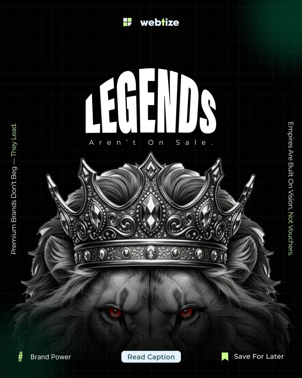
Open any modern feed such as Instagram, TikTok, YouTube or LinkedIn and you are instantly hit with visual noise. Bright colors, heavy text blocks and crowded layouts compete for attention. Instead of standing out, most posts blur together and overwhelm audiences who are already overstimulated.
This is where minimalist design proves its power. It is not about being plain or boring. It is about cutting through the chaos with clarity, elegance and intentional simplicity.
What Is Minimalist Design?
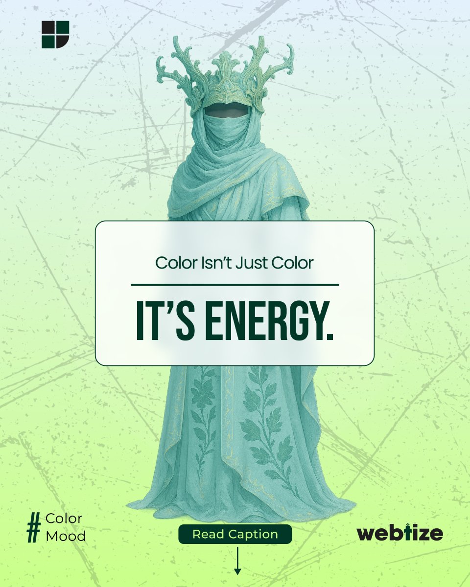
At its core, minimalist design means reducing unnecessary elements and highlighting what truly matters. It favors muted colors, clear layouts and purposeful use of white space. In feeds crowded with visual clutter, minimalist design allows your message to breathe.
Key elements include:
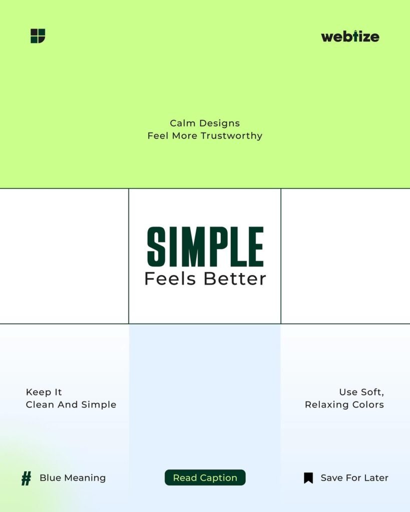
- Muted color palettes that soothe instead of overwhelm
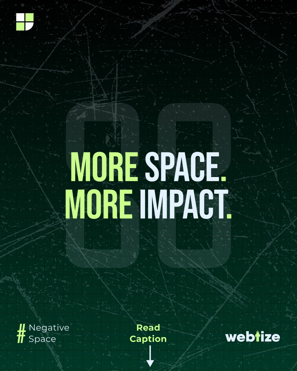
- Ample white space to guide focus
- Minimal distractions so your message is never lost
- Clean typography that conveys professionalism
The result is a design that feels trustworthy, comforting and easy to engage with.
Why Minimalist Design Wins in Marketing
Calms Overstimulated Audiences
When every other brand is shouting with neon graphics, simple visuals feel refreshing. They whisper elegance, and that whisper is what captures attention.
Builds Instant Trust
Clean, minimal visuals signal professionalism and confidence. They tell your audience you do not need gimmicks, you rely on clarity.
Boosts Engagement and Conversions
A clutter-free design removes decision fatigue. With fewer elements to process, audiences are more likely to take the next step, whether it is clicking, signing up or purchasing.
Future-Proofs Branding
Minimalism does not age quickly. While trendy styles fade, a minimalist design remains timeless.
Minimalist Design Tips for Social Media Feeds
If you want your visuals to stand out without overwhelming your audience, try these minimalist strategies:
- Choose muted tones like pastels, greys or earth-inspired shades instead of loud neons
- Use white space deliberately, it is not wasted space, it is a tool for focus
- Limit text to one clear headline and one supporting line
- Stick to one or two fonts that are legible and clean
- Prioritize one key message per post instead of trying to say everything at once
Not everything needs to shout to be heard.
Minimalist Design Examples in Marketing
Apple is famous for white backgrounds, simple product shots and clean typography. Aesop Skincare uses muted tones and minimal text to convey luxury. Nike campaigns often rely on one bold line of copy with a simple visual, letting the message dominate.
These brands prove that minimalist design sells because it creates trust, clarity and emotional comfort.
Final Thoughts
In today’s overstimulated digital world, audiences crave calm over chaos. By embracing minimalist design, you can transform your content from noise into clarity.
🤍 Muted colors
🤍 White space
🤍 Minimal distractions
= Trust, comfort and conversions.
When others fight for attention with volume, let your visuals whisper with elegance. That is where the real impact lies.
Call to Action
Ready to make your brand stand out with clarity? Adopt minimalist design in your social media, websites and ads today, because in a noisy feed, simplicity always wins.