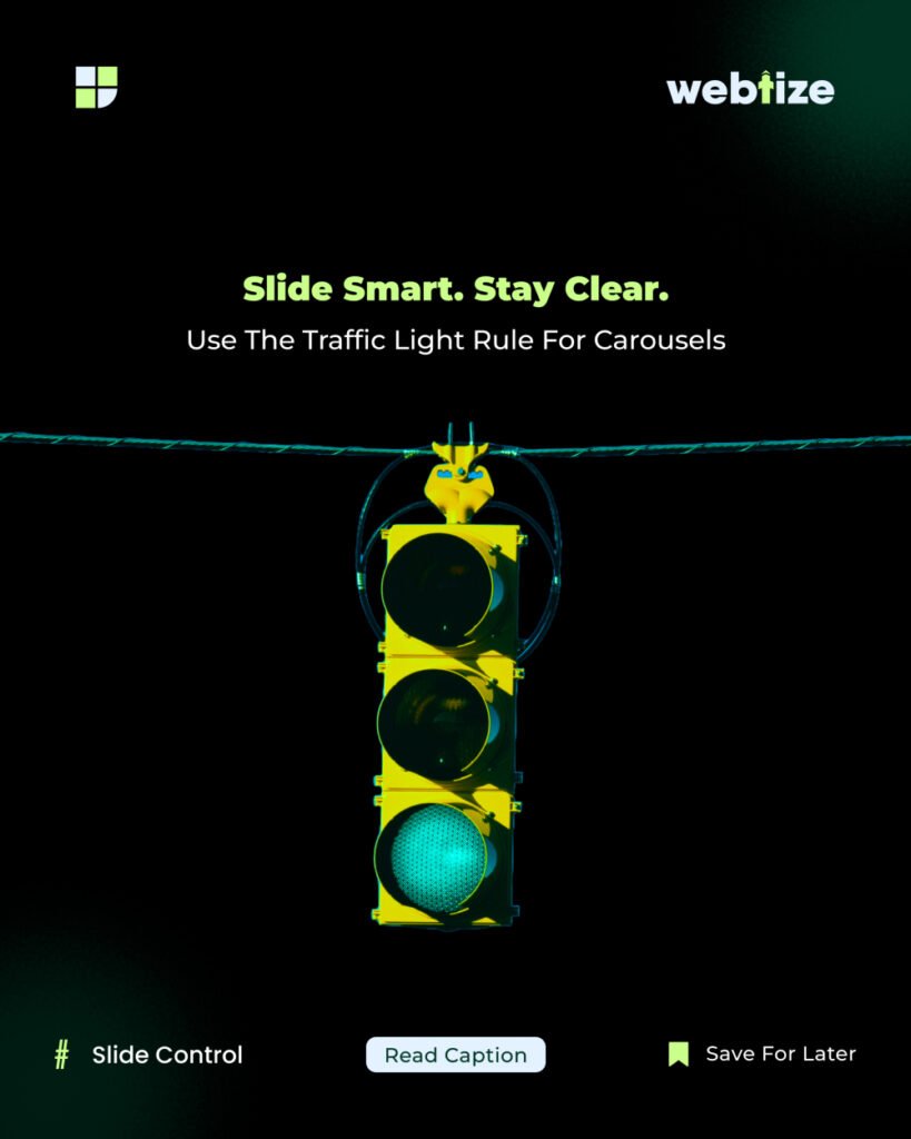
Stop. Pause. Go. This simple idea improves Instagram carousel design and results. It helps you earn attention, increase saves, and drive clicks. As a result, your content works harder with fewer slides.
An Instagram carousel is a multi image post that people swipe through. Because users spend more time with carousels, the format often lifts reach and saves. In addition, it supports step by step teaching, which improves clarity. This article focuses on Instagram carousel design that is clear and actionable.
Stop Pause Go: a simple framework
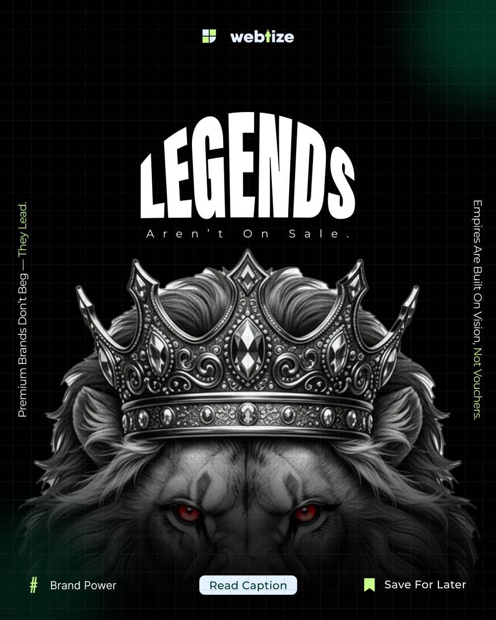
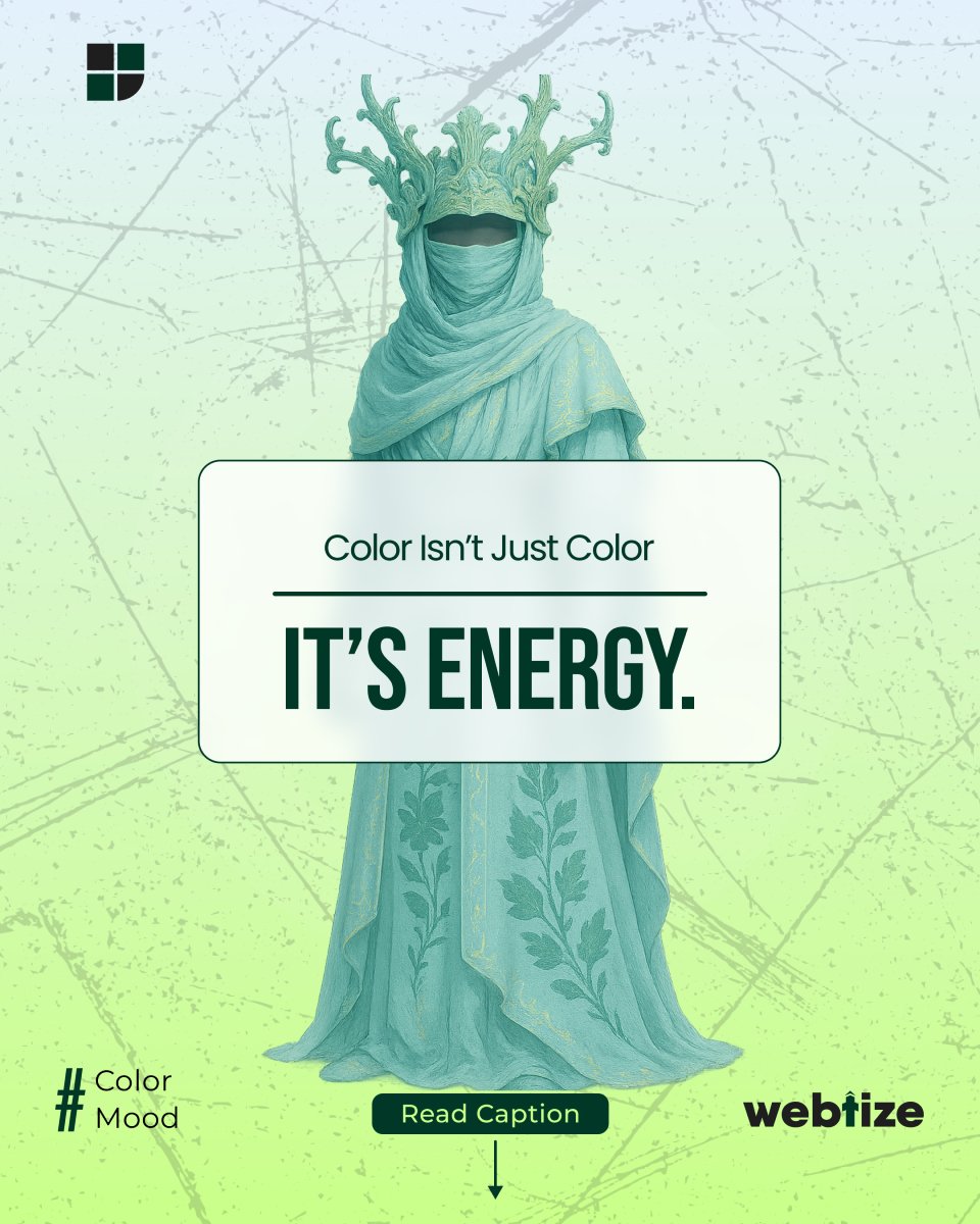
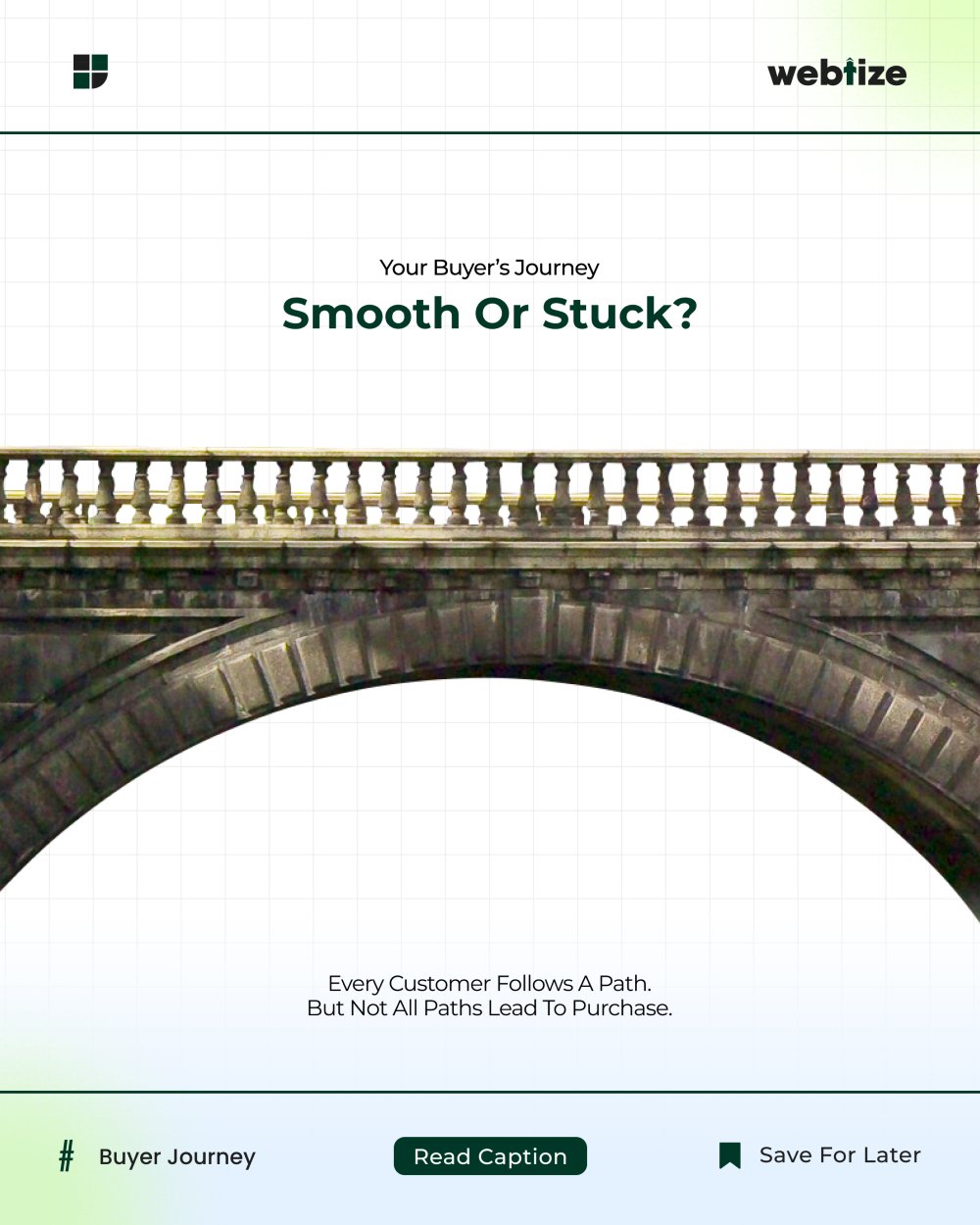
First, make slide one win the scroll. Use one idea, large type, and strong contrast. Promise a clear outcome in plain words.
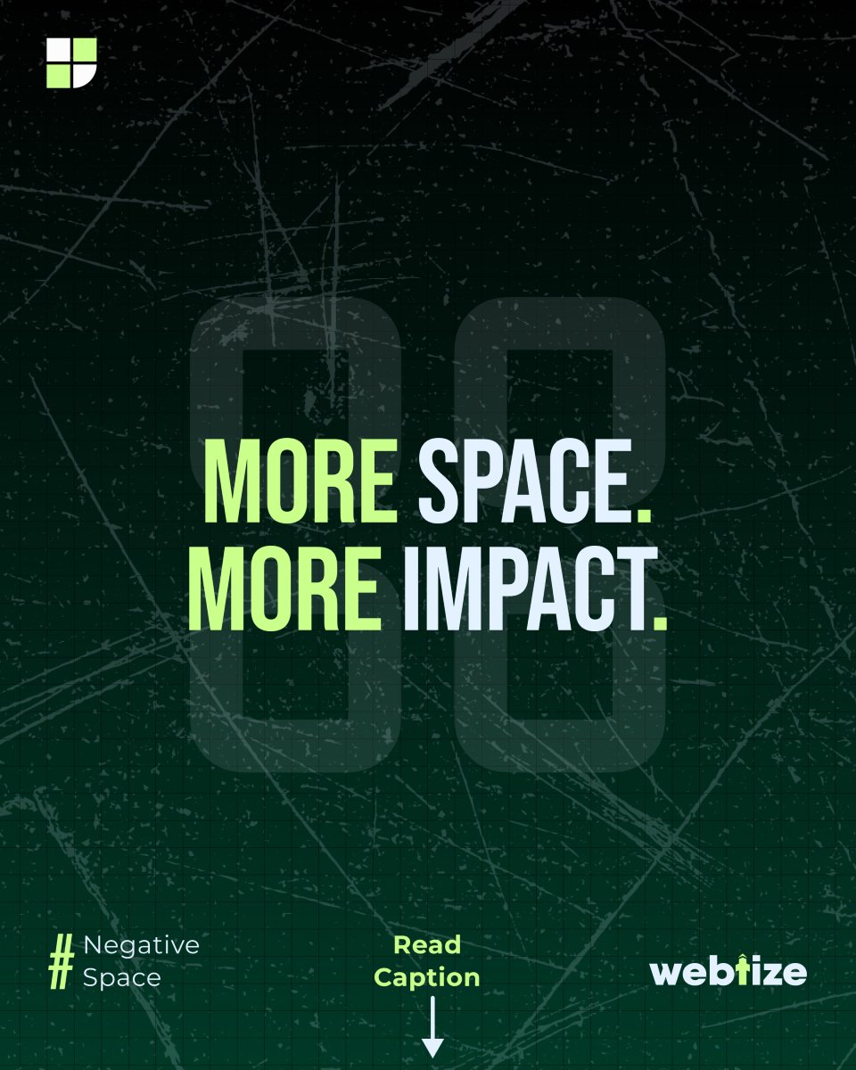
Next, remove clutter. In other words, reduce elements and shorten lines. As a result, viewers can think for a second and follow the logic.
Finally, lead to one next step. For example, ask the viewer to save the post or visit your link in bio. Match the call to action with the goal of the carousel.
This Instagram carousel design approach focuses on one message per slide. With clear Instagram carousel design, you reduce clutter and lift saves. Our Instagram carousel design checklist keeps flow and action aligned.
Checklist for building a carousel
- Define a single promise
- Keep lines short and scannable
- Use one visual focus per slide
- End with one clear action
A framework you can use today
- Define the outcome in one sentence. For example, teach three ways to improve hooks.
- Write a seven to nine slide outline. In addition, give each slide a single point.
- Draft slides one, two, and the final slide first. Consequently, the spine feels strong.
- Add proof or examples in the middle slides. For instance, show a before and after.
- Set visual hierarchy. Use large headlines, medium subheads, and small notes.
- Remove half the words. As a result, meaning becomes sharp.
- Add clear navigation. For example, use slide numbers.
- Place the call to action on the last slide. In addition, repeat the promise.
- Test on a phone screen. Therefore, spacing and contrast stay readable.
- Post, track, and improve the next version. Over time, performance rises.
Structure for nine slides
- Hook with a bold promise
- What will be covered
- Point one with a short example
- Point two with a short example
- Point three with a short example
- Mini summary
- Quick checklist
- Social proof or result
- Call to action that matches your goal
Frequent mistakes and fixes
Many ideas on one slide make people stop reading. Merge ideas or give each idea its own slide.
Decorative icons with no role pull attention away. Use visuals that explain the point.
Long paragraphs slow readers. Keep lines short and scannable.
A weak final slide drops engagement. Repeat the promise and give one action.
For platform basics, review Instagram Business: https://business.instagram.com/
For guidance on scannable content, see Nielsen Norman Group: https://www.nngroup.com/articles/scannability/
How to measure results and improve
Track saves, shares, profile visits, and link clicks. Saves signal usefulness. Shares show that people trust the content enough to pass it on. Profile visits and clicks show buying intent. Therefore, use these signals to plan the next carousel.
Work with Webtize
If you want a weekly carousel system you can scale, Webtize can help with strategy, writing, and design. Learn more at https://webtize.co/ and reach the team at https://webtize.co/contact/. Together, we turn carousels into consistent growth assets.