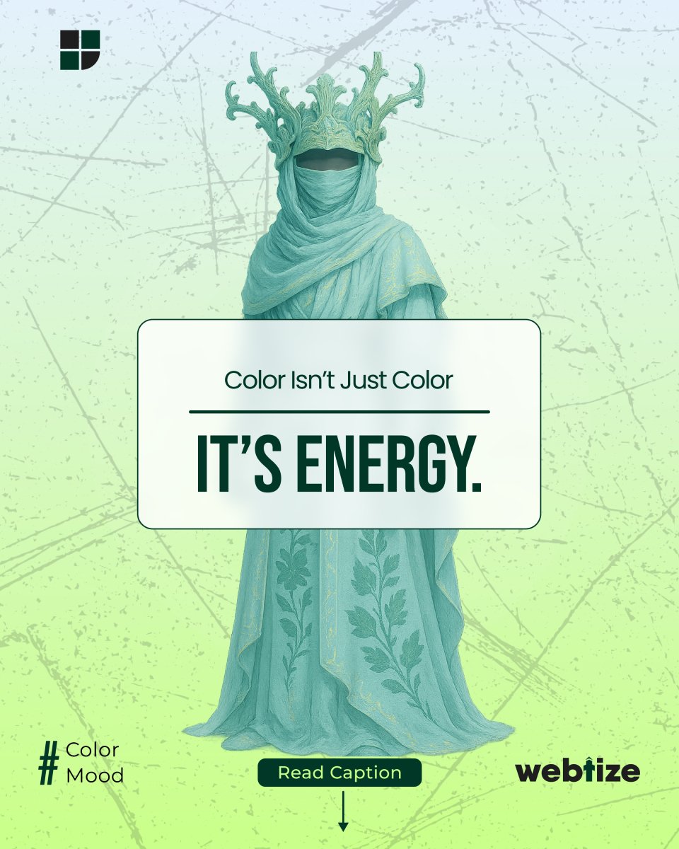
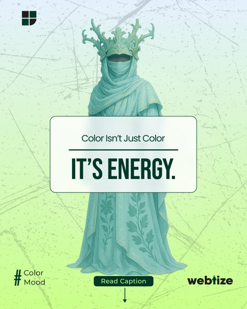
Every color carries energy. In design, color saturation , how vivid or muted a hue appears, directly shapes emotion and brand perception. The right intensity can make your brand feel youthful, calm, premium, or bold without ever changing the base hue. That is the foundation of color energy in branding.
While hue defines the family (red, blue, green), saturation determines personality. Loud colors shout for attention; muted tones whisper confidence and class. The key is understanding when to dial it up and when to tone it down.
Saturation power: loud vs calm brands
Color saturation influences brand mood faster than any logo or font. For example:
- High saturation evokes energy, excitement, and youth. Think of brands like Spotify, TikTok, or Red Bull. Each uses bold, bright palettes that radiate enthusiasm.
- Low saturation signals calm, premium quality, and reliability. Brands like Apple, Tiffany & Co., and Aesop use soft tones to feel elegant and intentional.
However, saturation must match audience expectations. A financial institution with neon gradients might seem untrustworthy, while a fashion label with muted beige tones suggests luxury. Therefore, balance emotion with clarity.
Muted palettes: elegance through restraint
Muted palettes are trending in 2025 because they communicate depth and authenticity. Slightly desaturated colors feel sophisticated and timeless, which is why luxury and sustainable brands often use them.
In addition, muted palettes create visual comfort. They reduce digital fatigue and allow typography and imagery to stand out naturally. Designers now use low-contrast palettes to express subtle confidence
Example
A skincare brand might reduce its pastel pink saturation by 20%. Instantly, the same hue transforms from playful to refined.
Don’t name colors rather adjust tone and intensity
It’s not about “picking a pink” or “choosing a blue.” It’s about crafting emotion through tone and saturation. Every brand color can shift personality through small adjustments:
- Increase saturation for vibrancy and youth
- Desaturate for minimalism and calm
- Warm a tone for friendliness
- Cool a tone for authority
Therefore, color is not static it evolves with your message. Naming colors locks creativity; tuning them keeps your brand flexible.
Seasonal and campaign-based color tests
Great brands treat color like strategy, not decoration. Saturation can change seasonally or campaign-to-campaign while maintaining core identity. For example, a travel company might use brighter tones for summer promotions and deeper hues for winter.
Testing saturation across ads, emails, and landing pages provides valuable insights. You may find that users click more on slightly brighter CTAs or stay longer on muted pages. As a result, you build a data-driven understanding of emotional color response.
Practical ways to manage color energy
1. Build saturation scales in your brand system
Create light, base, and deep variants for each color. This approach ensures flexibility without drifting off-brand.
2. Use contrast to guide hierarchy
Pair strong accent colors with softer backgrounds. Consequently, key actions stand out naturally.
3. Test emotional response
Gather small focus groups or run A/B tests to measure perception changes. Ask: Does this palette feel energetic or relaxed?
4. Design for accessibility
Ensure contrast ratios meet WCAG standards. Accessible colors not only improve usability but also enhance trust.
5. Document tone logic
In your brand guide, note the emotional role of each color. For example, “Soft coral = friendly introductions; Deep navy = authority anchors.”
Common mistakes in brand color use
- Overusing high saturation: causes visual fatigue and cheapens premium appeal.
- Ignoring contrast: leads to poor readability.
- Using too many hues: weakens identity consistency.
- Assuming one palette fits all: campaign goals differ; color energy should adapt.
Instead, use saturation strategically and measure its impact regularly.
Case studies: color energy done right
1. Airbnb
The updated coral tone is vibrant yet soft , approachable without losing sophistication.
2. Starbucks
Its green is moderately saturated, symbolizing freshness and calm. Adjustments in shade across product lines create seasonal variety without losing recognition.
3. Tesla
Clean black-white contrasts with restrained red accents convey confidence, precision, and speed.
These brands prove that consistency does not mean rigidity; rather, it means knowing the emotional role of each hue.
Why color energy matters in 2025
Design trends are cyclical, but emotional connection remains constant. With visual overload everywhere, simplicity and controlled color energy now define premium perception. Brands that master saturation can pivot ton from playful to serious, or from mass-market to luxury without losing authenticity.
Moreover, as AI-generated visuals become common, human-centered color psychology will stand out. Authentic, emotionally tuned palettes will separate thoughtful design from automation.
Work with Webtize
At Webtize, we help brands harness color energy to build emotion, trust, and differentiation. From saturation testing to complete rebranding, our designers craft palettes that evolve with your audience.
Explore services at Webtize.co and connect with us through our contact page. Let’s design colors that feel as good as they look.