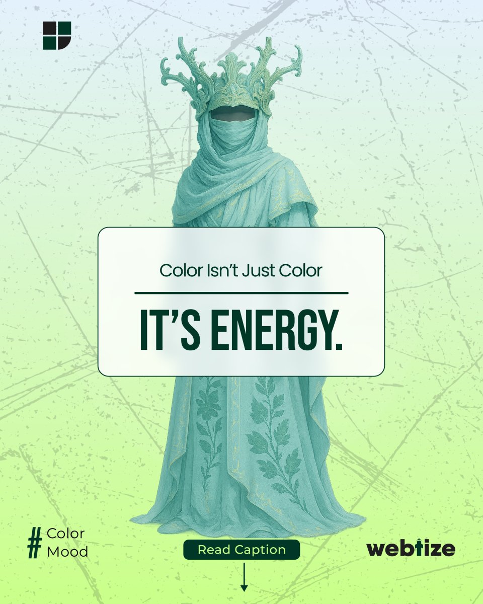
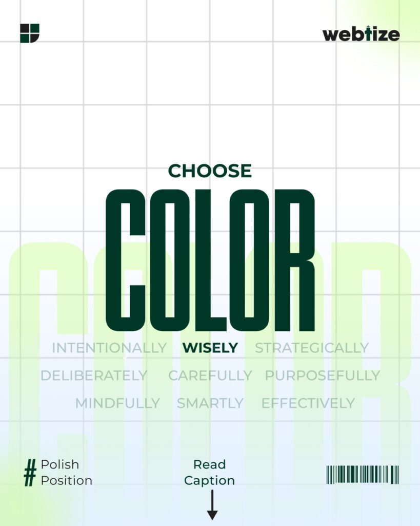
Your brand’s color is not only visual. It is psychological. Every hue tells a story and every tone evokes a feeling. When you plan color with intent, you guide perception, reduce friction, and help people decide. That is the core of brand color psychology.
Color signals mood and importance faster than words. It shapes the first impression and supports recognition across touchpoints. Used well, it highlights what matters and clarifies actions. However, color choices must be tested in real context, not guessed from a chart.
What color can and cannot do
Color influences attention and emotion. Yet responses vary by culture, age, and context. Modern research shows broad patterns with meaningful variations. Therefore, treat universal “color = emotion” lists as starting points, not laws. Validate with your audience.
How brand color psychology works in practice
Color sets tone. Neutrals create calm. Accents add urgency or delight. Primaries carry identity and must remain consistent. Because users skim before they read, your palette should make hierarchy obvious and actions unmistakable. In short, color helps people find what they need and feel safe moving forward.
A simple framework to craft your brand color palette
- Define the feeling
Write three words you want people to feel, such as trustworthy, energetic, or premium. - Choose one primary brand color
Select a single anchor hue that fits those feelings. Document its HEX and roles. - Add supporting neutrals
Pick two neutrals for backgrounds and text so content stays readable. - Pick one action accent
Reserve a high-contrast accent for calls to action and interactive states. - Create roles and tokens
Map colors to roles like primary, secondary, surface, and error. Use design-token names so teams stay aligned. Material Design’s role model is a good reference. - Validate accessibility
Check contrast on buttons, links, and text. Meet WCAG AA: at least 4.5:1 for normal text and 3:1 for large text. - Ship and test
Apply the palette to real components. Measure click-through on primary buttons and form completion before and after the change.
Color and accessibility: make beauty usable
Good color is also legible. Contrast enables reading on any device and in any light. Moreover, do not use color as the only way to show meaning. Pair color with labels, icons, or patterns so people with color-vision differences can still complete tasks. This practice is required in the Web Content Accessibility Guidelines.
Industry-aligned starting points
These are practical starting points, not rigid rules. Always test.
- Finance and B2B
Deeper, desaturated blues and cool neutrals support stability and clarity, with a warm accent for actions. - Healthcare and wellness
Softer blues or greens with generous whitespaces reduce anxiety. Use a distinct, high-contrast action color for appointments. - Technology and SaaS
Neutral foundations with a bold, memorable accent help CTAs stand out across light and dark modes. - Food and hospitality
Warmer hues can feel inviting, while a restrained accent prevents clutter around menus and pricing.
These choices reflect patterns seen in public design systems and usability research, but your brand promise and audience should lead the final call. Check more on Material Design
Common mistakes and fast fixes
Too many similar hues
Close shades blur hierarchy. Fix this by limiting the palette and increasing contrast between roles.
Color doing all the work
If labels are vague, color cannot rescue clarity. Fix copy first, then color.
Low contrast on actions
Buttons that blend in do not get clicks. Raise contrast and size to meet WCAG AA.
Color as the only signal
People miss red-only errors or status chips. Add icons, text, or patterns so meaning is accessible.
Measuring impact: from emotion to outcomes
Treat color as a performance lever. Track click-through on primary CTAs, time on task for key flows, and conversion rate on pricing and forms. When you adjust color for clarity and contrast, watch Core Web Vitals and bounce alongside conversion so you can separate speed issues from visual issues. Use short user tests to confirm that people can find and name the primary action without hints.
Work with Webtize
At Webtize, we do not pick colors at random. We design color systems that create the right emotional response and measurable business results. If you need a palette that builds trust and converts on landing pages, dashboards, and ads, we can help. Explore services at https://webtize.co/ and contact the team at https://webtize.co/contact/.