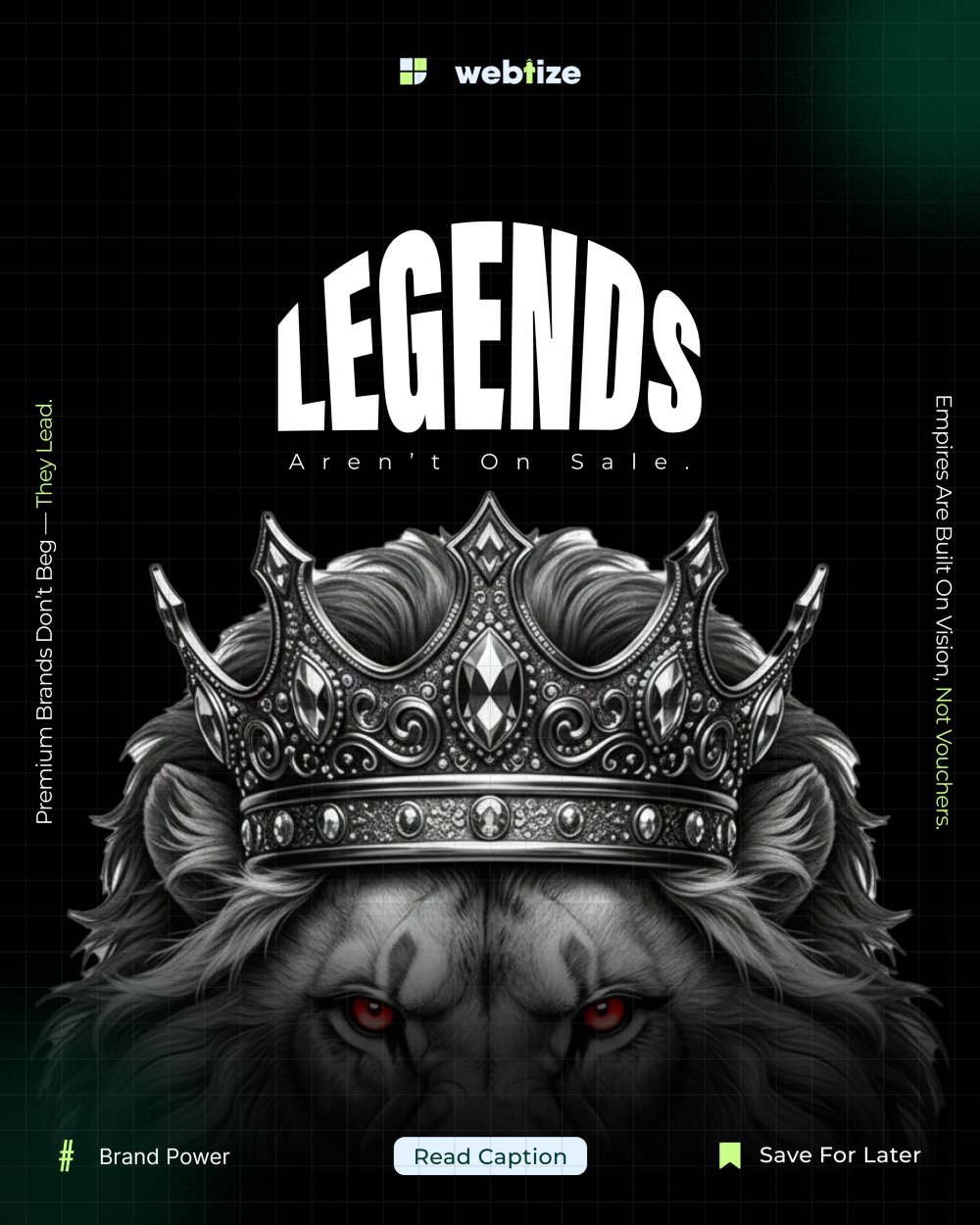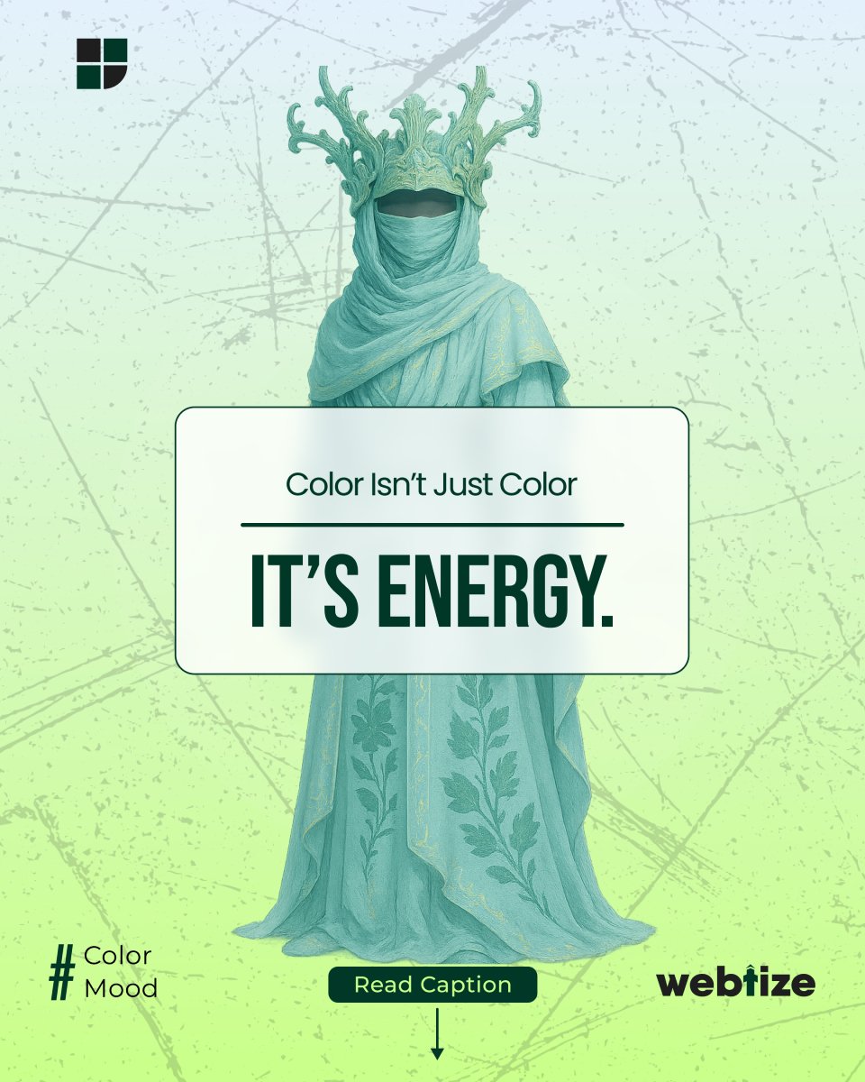
Blue in branding is more than a color choice. It is a strategy. When people scan a page or a product, color is one of the first cues their brain reads. Blue tends to signal reliability, calm, and clarity. That is why banks, insurers, technology companies, and public services use it to build credibility. Used with intention, blue in branding helps audiences feel safe enough to keep reading, keep exploring, and eventually take action.
Trust is not created by color alone. However, color sets the tone for every other decision in the experience. If your value proposition is complex, blue can lower perceived risk. If your interface contains dense information, blue can help users focus. Because of that, blue in branding often pairs well with data heavy dashboards, onboarding flows, and forms where accuracy matters.
How color shapes first impressions
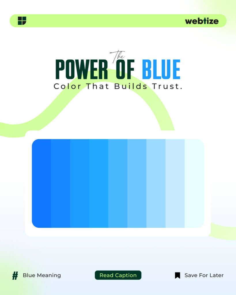
People skim before they read. Therefore color works as a fast signal that guides perception. Lighter tints of blue feel open and friendly, which suits startups, education, and wellness. Darker tones feel stable and expert, which suits finance and enterprise software. Because the spectrum of blue covers both ends, the same brand can use tints for background and a deeper anchor for primary elements without losing coherence.
Color also affects memory. A single, consistent anchor blue used across your logo, buttons, and key links reinforces recall. In addition, blue is common on the web, which means users know how to interpret it. Links that are blue still read as links, which reduces cognitive load and creates smoother navigation.
Checklist for blue in branding
- Define the feeling you want to signal, such as trust, clarity, or confidence.
- Choose one anchor blue and write a short name for it so your team can reference it.
- Create tints for backgrounds, cards, and charts where subtlety matters.
- Select one contrasting accent for call to action elements.
- Set a system for states such as hover, focus, active, and disabled.
- Test color on actual components instead of blank artboards.
- Validate contrast with a standards based tool.
- Document color usage in your design system so teams stay aligned.
- Review the palette on both light and dark modes.
- Revisit color choices after usability testing.
Choosing the right shade and combinations
Start with a single anchor blue that reflects your brand position. For a modern, technical mood, pick a cool, slightly desaturated blue that sits comfortably on white or cool gray. For a warmer, human mood, pick a blue with a touch of green and pair it with warm gray typography. Then add a limited set of tints for backgrounds and data viz bands. Avoid introducing many near identical blues. Instead, control hierarchy with size, spacing, and weight before adding more hues.
Consider cultural context. In many markets, blue reads as trustworthy and professional. In some regions, specific shades carry local meaning in government or health care. Research your audience and check brand conflicts in your category. Consistency across touchpoints matters more than any single shade, so document the hex values and usage examples early.
Accessibility and contrast
Color must remain readable. Aim for WCAG AA or AAA contrast ratios for text, icons, and interactive elements. A blue button on a white background should meet at least a 4.5 to 1 ratio for normal text. Borders and focus rings must also be visible for keyboard users. You can verify contrast with the Web Content Accessibility Guidelines quick reference at https://www.w3.org/WAI/WCAG21/quickref/. Following accessibility standards does not only avoid risk. It expands your addressable audience and improves conversion on every device.
Where blue works best in UI and marketing
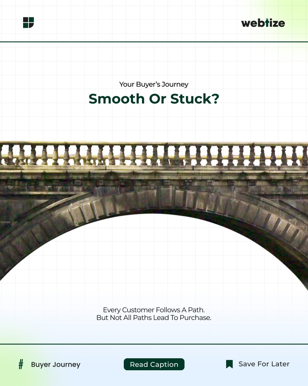
Blue supports complex decisions because it competes less with data. Navigation bars, tabs, and breadcrumb trails feel organized in blue. Primary buttons, links, and form focus states look familiar when blue is used with intention. Information alerts, progress states, and empty state illustrations also benefit from blue because these patterns need calm rather than urgency.
In marketing, blue is effective in trust building placements. Use it in hero backgrounds with clear typography. Use it in testimonials, security badges, and pricing tables to reduce anxiety. For ads and landing pages, combine blue for structure with a high contrast accent color for the primary action. Test a warm accent such as orange or coral against blue to create a clear, accessible call to action without visual noise.
Common mistakes and easy fixes
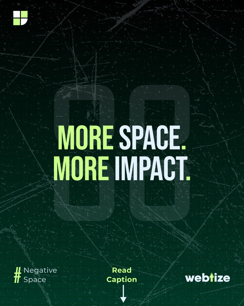
Using only blue everywhere creates a flat experience. Fix this by adding typographic hierarchy and more whitespace before adding additional colors. Relying on saturated blue in large areas can feel cold on mobile. Fix this by using softer tints for backgrounds and reserving saturated tones for small, high impact elements. Mixing many close blues causes inconsistency. Fix this by defining the anchor, two tints, and one shade, then sticking to them across surfaces.
Another mistake is assuming that a single palette works for all content types. Product documentation, dashboards, and marketing pages have different tasks. Use your anchor blue for identity and navigation. Then fine tune tints and accents per context. A documentation site might prefer softer tints, while a sales page can handle slightly stronger contrasts.
Measuring impact and iterating
Treat color decisions like any other performance lever. Track bounce rate on landing pages that switch to a blue primary theme. Measure form completion when the focus ring switches to a visible blue state. Watch time on task and error rates in complex flows after color updates. For brand assets, check recall in post campaign surveys. You can also run controlled tests on button colors and link styles to validate that blue improves clarity for your audience. Over time, combine behavioral data with qualitative feedback from user interviews to refine shade choices.
Examples and references to guide decisions
Public design systems show how established teams use blue to balance clarity and personality. Review these resources to improve your approach:
- Material Design color guidance by Google: https://m3.material.io/styles/color/overview
- IBM Design Language color system: https://www.ibm.com/design/language/color/
- Nielsen Norman Group on color in user interfaces: https://www.nngroup.com/articles/color-ui-design/
These references demonstrate how blue supports hierarchy, states, and accessibility across complex products. Use them to cross check your choices before rollout.
Work with Webtize
If you want a palette that matches your market and converts on ads, landing pages, and dashboards, Webtize can help. Explore services at https://webtize.co/ and contact the team at https://webtize.co/contact/. Together we will build a color system that makes the right first impression and keeps earning trust with every interaction. When blue in branding is defined with care, everything from headlines to buttons feels coherent and dependable.